Botticelli-Inspired Color Palettes: Graceful Line, Tempera Tones, and Florals
Botticelli-inspired coloring is graceful, linear, and lyrical. It suits floral pages, mythological scenes, angels, fashion, portraits, flowing hair, and pages with elegant contour.
Sandro Botticelli worked in fifteenth-century Florence. His tempera paintings and drawings are known for refined outlines, rhythmic drapery, delicate faces, pale color, and ornamental grace. This is different from smoky High Renaissance sfumato: Botticelli is about line.
What This Style Teaches
The useful traits to look for are:
- clear graceful contour
- pale rose, blue, green, and gold tones
- rhythmic hair and drapery
- floral detail
- delicate line preservation
Botticelli-Inspired Color Palettes should feel like a visual translation, not a costume. Let delicate line, pale color, and graceful movement guide the page, then use the artist reference as a boundary for value, rhythm, and restraint. The best results usually come from leaving some areas quieter than you first planned.
Best Pages to Try
This approach works especially well with people coloring pages, fashion coloring pages, flower coloring pages, mythology coloring pages. The page should leave room for delicate line, pale color, and graceful movement, even if the subject is not a literal museum scene.
For a first attempt, choose medium detail with one clear focal area. That balance leaves room for delicate line, pale color, and graceful movement without burying the main idea in tiny spaces.
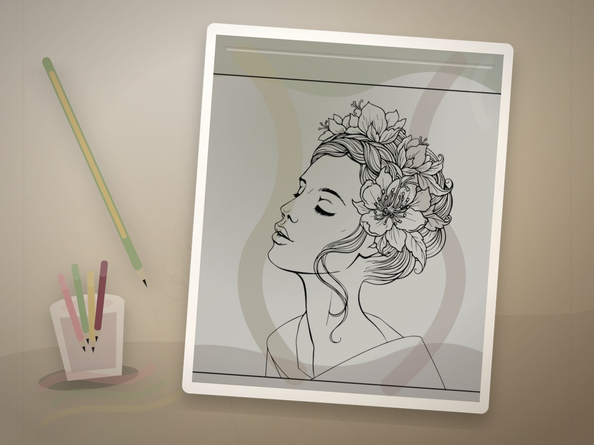
The strongest printable page is one where the line art already hints at flowing hair, fabric, flowers, shells, and gentle figure pages. You do not need an exact art-history subject; you need a page with shapes that can carry the same light, contour, pattern, or movement.
A spare print is useful, but use it with a specific question about delicate line, pale color, and graceful movement. Testing one decision keeps the finished page from becoming overworked.
Palette and Materials
Suggested palette: #c64f4f, #2f6fa3, #f0c987, #f4e7cf, #8fa86b.
Colored pencils are best because the style depends on line preservation and pale layers. Water-based markers can work for flat garments if used lightly.
Treat the palette as a limited studio set for delicate line, pale color, and graceful movement. One color should carry the main mood, one should build structure, one should soften transitions, and one should be held back for the final accent.
Rose, pale green, soft blue, warm cream, and light-pressure pencils will usually get you closer to the style than a large rainbow set. A smaller tool group keeps the page from drifting away from the reference mood.
Step-by-Step Method
- Protect the printed linework. Use lighter pressure near faces, hair, and fine drapery.
- Choose tempera-like colors: muted blue, shell pink, ivory, sage, warm gold, and soft red.
- Color fabric in long strokes that follow the fold direction.
- Keep shadows transparent and avoid heavy black.
- Use gold or ochre accents sparingly on halos, trim, flowers, or borders.
Pause after the first third of the page and compare it with the style goal. If the page has lost delicate line, pale color, and graceful movement, adjust value and repetition before filling more spaces.
Finishing Judgment for Botticelli-Inspired Color Palettes
The clearest sign of a finished page is hierarchy. Decide what should be seen first, what should support it, and what can stay quiet. The outline remains elegant because the shading never overpowers it.
Edges are part of the style decision when the outline remains elegant because the shading never overpowers it. Keep the important contour or highlight crisp, then let secondary texture soften into the paper so the page has depth without becoming fussy.
Before adding final accents, view the page from across the room or at thumbnail size. If the main idea still reads as delicate line, pale color, and graceful movement, the page needs fewer additions than you think.
Where Botticelli-Inspired Color Palettes Works Best
On figure or portrait pages, apply the style first to the face, hands, hair, or clothing fold. That focal area should show the strongest version of delicate line, pale color, and graceful movement.
On flowing hair, fabric, flowers, shells, and gentle figure pages, translate the reference through palette and edge quality. A few disciplined details will say more than forcing every space to announce the source.
On dense patterns, simplify around delicate line, pale color, and graceful movement. Choose two repeating motifs for the strongest color and let the remaining shapes act as rhythm, border, or rest.
Common Mistakes to Avoid
- Do not make the shadows smoky and dark; that belongs to a different Renaissance lesson.
- Do not overpower the line art with heavy marker edges.
- Do not use neon colors if you want a historical mood.
The biggest risk is over-explaining the reference. A page can feel inspired by a style with only a few disciplined choices around delicate line, pale color, and graceful movement: palette, value, edge quality, and one repeated motif.
If a new color appears late, make it serve the plan for delicate line, pale color, and graceful movement. Echo it in one small place or keep it so limited that it reads as a deliberate accent.
Example Practice
Print a figure or floral page. Use shell pink, muted blue, sage, cream, and ochre. Follow every fold and hair strand with directional pencil strokes, then add only a few warm gold details.
After the exercise, look for the one decision that made delicate line, pale color, and graceful movement clearer. Repeat that decision on the next page before adding a second new skill.
Troubleshooting Botticelli-Inspired Color Palettes
If the page looks flat, check whether delicate line, pale color, and graceful movement is actually visible. Add contrast near the focal point, repeat the key color, or reduce a background that is pulling too much attention.
If delicate line, pale color, and graceful movement feels weak, make one decision stronger instead of adding five new ones. Deepen the focal contrast, repeat the accent, or simplify the background.
Lift the pressure and add warmth with peach instead of heavy brown. That single correction usually does more than adding another layer everywhere.
Related Coloring Guides
Continue with flowing art nouveau color, Renaissance sfumato technique, flower coloring ideas.
Read those next if you want delicate line, pale color, and graceful movement to connect with broader skills such as light planning, color restraint, texture, or controlled accents.
Next Page to Print
Choose people coloring pages with one visible place for delicate line, pale color, and graceful movement. Limit the first version to the palette and tool group above so the style remains clear.
For the second version, change only one variable that affects delicate line, pale color, and graceful movement: a darker background, a softer edge, a different accent, or a new subject. That comparison teaches more than jumping to a completely unrelated page.
Quick FAQ
Do I need to copy the original artist exactly?
No. Use the artist or movement as a source of decisions, not as an imitation test. A limited palette, a clear value plan, and one signature visual idea around delicate line, pale color, and graceful movement are enough.
What should I print first?
Start with floral figure pages. It should have enough detail to show the technique, but not so much detail that every mark becomes a decision.
How do I know when to stop?
Stop when the outline remains elegant because the shading never overpowers it. If another layer would make the focal point less clear, the page is already finished enough.
Further Reading
Final Thought
Botticelli-Inspired Color Palettes gives a printable page an art-historical point of view without turning coloring into a copy exercise. Let delicate line, pale color, and graceful movement guide the strongest choices, keep the palette disciplined, and leave enough quiet space for the style to breathe.