Frida Kahlo-Inspired Coloring Pages: Symbolic Color, Florals, and Self-Expression
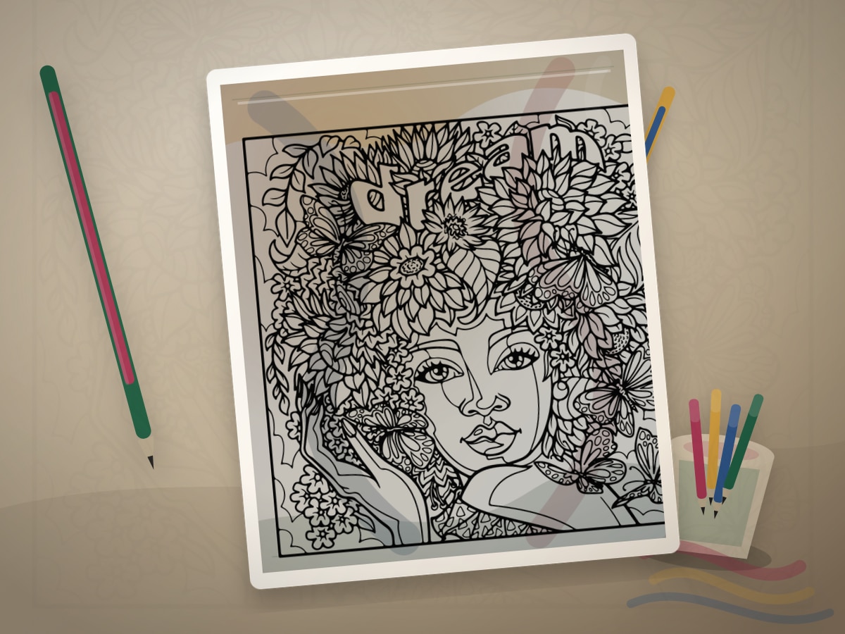
Frida Kahlo-inspired coloring should be approached with respect. The goal is not costume or cliche; it is personal symbolism, direct gaze, strong color, plants, animals, and meaningful details.
Frida Kahlo, a Mexican artist of the twentieth century, is closely associated with self-portraiture, personal narrative, Mexican identity, plants, animals, and symbolic objects. For coloring, the useful principle is making each color and motif carry meaning.
What This Style Teaches
The useful traits to look for are:
- symbolic objects
- floral framing
- strong complementary color
- direct portrait focus
- personal narrative details
Frida Kahlo-Inspired Coloring Pages should feel like a visual translation, not a costume. Let symbolic color that feels personal rather than decorative only guide the page, then use the artist reference as a boundary for value, rhythm, and restraint. The best results usually come from leaving some areas quieter than you first planned.
Best Pages to Try
This approach works especially well with face coloring pages, people coloring pages, flower coloring pages, animal coloring pages. The page should leave room for symbolic color that feels personal rather than decorative only, even if the subject is not a literal museum scene.
For a first attempt, choose medium detail with one clear focal area. That balance leaves room for symbolic color that feels personal rather than decorative only without burying the main idea in tiny spaces.
The strongest printable page is one where the line art already hints at flowers, portraits, animals, mirrors, plants, and meaningful objects. You do not need an exact art-history subject; you need a page with shapes that can carry the same light, contour, pattern, or movement.
A spare print is useful, but use it with a specific question about symbolic color that feels personal rather than decorative only. Testing one decision keeps the finished page from becoming overworked.
Palette and Materials
Suggested palette: #0f7c6b, #c1272d, #f2b84b, #234c8c, #f5dfc2.
Colored pencils work well for portraits, while markers can give flowers and backgrounds strong flat color. Use gel pens sparingly on jewelry or small decorative details.
Treat the palette as a limited studio set for symbolic color that feels personal rather than decorative only. One color should carry the main mood, one should build structure, one should soften transitions, and one should be held back for the final accent.
Deep green, magenta, marigold, cobalt, and saturated pencils or markers will usually get you closer to the style than a large rainbow set. A smaller tool group keeps the page from drifting away from the reference mood.
Step-by-Step Method
- Choose a theme before choosing colors: memory, resilience, home, garden, family, or imagination.
- Use strong but controlled color: teal, red, marigold, cobalt, leaf green, and warm skin tones.
- Frame faces or central figures with flowers, leaves, birds, or objects that support the mood.
- Repeat one symbolic color in several places.
- Keep the face or central subject clear; let surrounding motifs carry ornament.
Pause after the first third of the page and compare it with the style goal. If the page has lost symbolic color that feels personal rather than decorative only, adjust value and repetition before filling more spaces.
Finishing Judgment for Frida Kahlo-Inspired Coloring Pages
The clearest sign of a finished page is hierarchy. Decide what should be seen first, what should support it, and what can stay quiet. The strongest colors support the central figure or symbol.
Edges are part of the style decision when the strongest colors support the central figure or symbol. Keep the important contour or highlight crisp, then let secondary texture soften into the paper so the page has depth without becoming fussy.
Before adding final accents, view the page from across the room or at thumbnail size. If the main idea still reads as symbolic color that feels personal rather than decorative only, the page needs fewer additions than you think.
Where Frida Kahlo-Inspired Coloring Pages Works Best
On figure or portrait pages, apply the style first to the face, hands, hair, or clothing fold. That focal area should show the strongest version of symbolic color that feels personal rather than decorative only.
On flowers, portraits, animals, mirrors, plants, and meaningful objects, translate the reference through palette and edge quality. A few disciplined details will say more than forcing every space to announce the source.
On dense patterns, simplify around symbolic color that feels personal rather than decorative only. Choose two repeating motifs for the strongest color and let the remaining shapes act as rhythm, border, or rest.
Common Mistakes to Avoid
- Do not reduce the style to a flower crown.
- Do not turn biography or pain into decoration.
- Do not crowd the face with so many motifs that the expression disappears.
The biggest risk is over-explaining the reference. A page can feel inspired by a style with only a few disciplined choices around symbolic color that feels personal rather than decorative only: palette, value, edge quality, and one repeated motif.
If a new color appears late, make it serve the plan for symbolic color that feels personal rather than decorative only. Echo it in one small place or keep it so limited that it reads as a deliberate accent.
Example Practice
Choose a portrait or floral page. Pick three symbols and five colors. Color the face softly, surround it with meaningful flowers or animals, and repeat one accent color throughout the border.
After the exercise, look for the one decision that made symbolic color that feels personal rather than decorative only clearer. Repeat that decision on the next page before adding a second new skill.
Troubleshooting Frida Kahlo-Inspired Coloring Pages
If the page looks flat, check whether symbolic color that feels personal rather than decorative only is actually visible. Add contrast near the focal point, repeat the key color, or reduce a background that is pulling too much attention.
If symbolic color that feels personal rather than decorative only feels weak, make one decision stronger instead of adding five new ones. Deepen the focal contrast, repeat the accent, or simplify the background.
Choose one emotional color to lead before adding more accents. That single correction usually does more than adding another layer everywhere.
Related Coloring Guides
Continue with flower coloring pages, decorative portrait frames, adult coloring for relaxation.
Read those next if you want symbolic color that feels personal rather than decorative only to connect with broader skills such as light planning, color restraint, texture, or controlled accents.
Next Page to Print
Choose face coloring pages with one visible place for symbolic color that feels personal rather than decorative only. Limit the first version to the palette and tool group above so the style remains clear.
For the second version, change only one variable that affects symbolic color that feels personal rather than decorative only: a darker background, a softer edge, a different accent, or a new subject. That comparison teaches more than jumping to a completely unrelated page.
Quick FAQ
Do I need to copy the original artist exactly?
No. Use the artist or movement as a source of decisions, not as an imitation test. A limited palette, a clear value plan, and one signature visual idea around symbolic color that feels personal rather than decorative only are enough.
What should I print first?
Start with portrait and floral pages. It should have enough detail to show the technique, but not so much detail that every mark becomes a decision.
How do I know when to stop?
Stop when the strongest colors support the central figure or symbol. If another layer would make the focal point less clear, the page is already finished enough.
Further Reading
Final Thought
Frida Kahlo-Inspired Coloring Pages gives a printable page an art-historical point of view without turning coloring into a copy exercise. Let symbolic color that feels personal rather than decorative only guide the strongest choices, keep the palette disciplined, and leave enough quiet space for the style to breathe.