How to Shade Coloring Pages: Light, Shadows, and Simple Depth
Shading makes a coloring page feel dimensional, but it does not need to be complicated. The most important choice is light direction. Once you know where the light comes from, shadows become decisions instead of guesses.
This guide covers simple shading for printable pages: form shadows, cast shadows, gradients, and small details that make objects feel grounded.
What This Technique Builds
The practical skills to focus on are:
- one light source
- light middle dark values
- cast shadows
- overlap shadows
- controlled highlights
Shading Coloring Pages becomes easier when the page has one clear purpose. Use light direction that makes flat line art feel dimensional as the starting point, then choose flowers, faces, fabric, objects, animals, and scenes with cast shadows so the subject and the technique help each other. That choice saves more time than any complicated palette.
Best Pages to Try
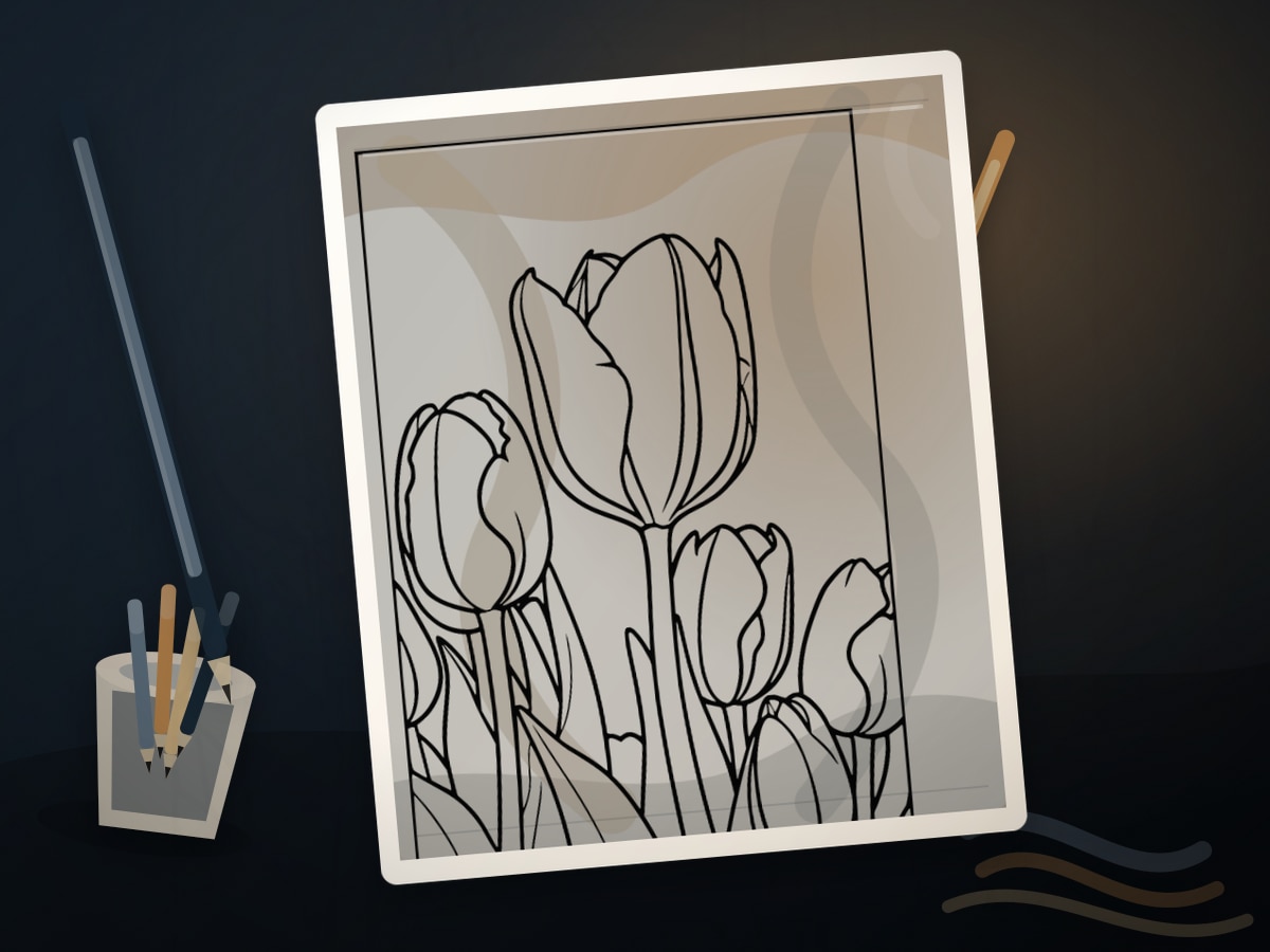
This approach works especially well with animal coloring pages, face coloring pages, object coloring pages, flower coloring pages. The page should make light direction that makes flat line art feel dimensional visible without asking you to solve every coloring problem at once.
For a first attempt, choose medium detail with one clear focal area. That balance leaves room for light direction that makes flat line art feel dimensional without burying the main idea in tiny spaces.
Page choice is part of the technique. Look for flowers, faces, fabric, objects, animals, and scenes with cast shadows, then decide whether the main subject, border, or background deserves the first color decision.
A spare print is useful, but use it with a specific question about light direction that makes flat line art feel dimensional. Testing one decision keeps the finished page from becoming overworked.
Palette and Materials
Suggested palette: #f3d7b6, #b9875d, #665243, #5e7890, #f8f2e8.
Colored pencils are easiest for beginner shading. Alcohol markers can create smooth base values, but pencils give better control over small shadows.
Think of the palette as a set of roles for light direction that makes flat line art feel dimensional: main color, support color, shadow color, rest color, and accent. If a color does not have a role, leave it out for this page.
A light pencil, a middle pencil, a shadow pencil, and a sharpener are enough for a focused first version. Add specialty pens, pastels, or paint only after the main color structure is already working.
Step-by-Step Method
- Mark the light source with a tiny note or arrow on scrap paper.
- Keep the side facing the light lighter.
- Darken the side turning away from the light.
- Add cast shadows where objects touch tables, ground, clothing, or each other.
- Use the darkest color only in small contact areas and deepest folds.
Once the first choices are in place, keep repeating the logic around light direction that makes flat line art feel dimensional. The page looks stronger when later areas echo the first decisions instead of starting a new plan in every corner.
How to Make Shading Coloring Pages Look Finished
The clearest sign of a finished page is hierarchy. Decide what should be seen first, what should support it, and what can stay quiet. Shadows sit under forms and highlights face the same light source.
Edges and transitions should support light direction that makes flat line art feel dimensional. Crisp edges help small details and focal shapes, while softer transitions help backgrounds, shadows, petals, fur, water, and glow effects.
Before adding final accents, view the page from across the room or at thumbnail size. If the main idea still reads as light direction that makes flat line art feel dimensional, the page needs fewer additions than you think.
Where Shading Coloring Pages Works Best
On subject pages, begin with the feature that gives flowers and faces its personality: the main bloom, face, animal eye, central motif, or largest shape.
On patterns and mandalas, repeat decisions by shape family so light direction that makes flat line art feel dimensional stays deliberate. Matching forms should relate to each other, even when the value shifts from ring to ring or corner to corner.
Keep the supporting background quieter than flowers and faces unless the background is the reason you printed the page.
Common Mistakes to Avoid
- Do not outline every shape with dark color.
- Do not put shadows on both sides of an object unless there are two light sources.
- Do not use pure black as your only shadow color.
The main risk is treating every area as equally important. A strong page gives light direction that makes flat line art feel dimensional a lead subject, supporting details, and quiet spaces that let the eye rest.
If the page changes direction halfway through, connect the new choice to light direction that makes flat line art feel dimensional. Repetition makes the change look intentional.
Example Practice
Print a page with fruit, flowers, or animals. Put the light in the upper left. Add a light base, a medium shadow on lower-right forms, and a small dark cast shadow underneath.
After the exercise, look for the one decision that made light direction that makes flat line art feel dimensional clearer. Repeat that decision on the next page before adding a second new skill.
Troubleshooting Shading Coloring Pages
If the page looks flat, check whether light direction that makes flat line art feel dimensional is actually visible. Add contrast near the focal point, repeat the key color, or reduce a background that is pulling too much attention.
If light direction that makes flat line art feel dimensional feels weak, make one decision stronger instead of adding five new ones. Deepen the focal contrast, repeat the accent, or simplify the background.
Draw a tiny arrow on scrap paper if the light direction gets confusing. That single correction usually does more than adding another layer everywhere.
Related Coloring Guides
Continue with secret light sources, Rembrandt light and shadow, pencil layering.
Together, those guides help turn light direction that makes flat line art feel dimensional from a single idea into a repeatable coloring habit.
Next Page to Print
Choose animal coloring pages and decide the main color role before you start. A simple plan usually beats a large pile of tools when light direction that makes flat line art feel dimensional is the goal.
Print a second copy only if you want to test a different palette or tool around flowers and faces. Comparing two versions of the same design is one of the fastest ways to improve.
Quick FAQ
Can a beginner start with this approach?
Yes, if you start with pages with rounded or overlapping forms. Keep the first version small, test the tool or palette, and let the page teach one skill at a time.
What should I print first?
Start with pages with rounded or overlapping forms. It should have enough detail to show the technique, but not so much detail that every mark becomes a decision.
How do I know when to stop?
Stop when shadows sit under forms and highlights face the same light source. If another layer would make the focal point less clear, the page is already finished enough.
Final Thought
Shading Coloring Pages becomes more satisfying when the page has a clear visual promise. Choose the right printable, repeat the strongest decisions, and let the subject tell you where the detail belongs.