Seurat Pointillism Coloring Technique: Dots, Density, and Optical Mixing
Pointillism coloring is slow in a useful way. Instead of filling an area with smooth pressure, you build color through dots, density, and optical mixing.
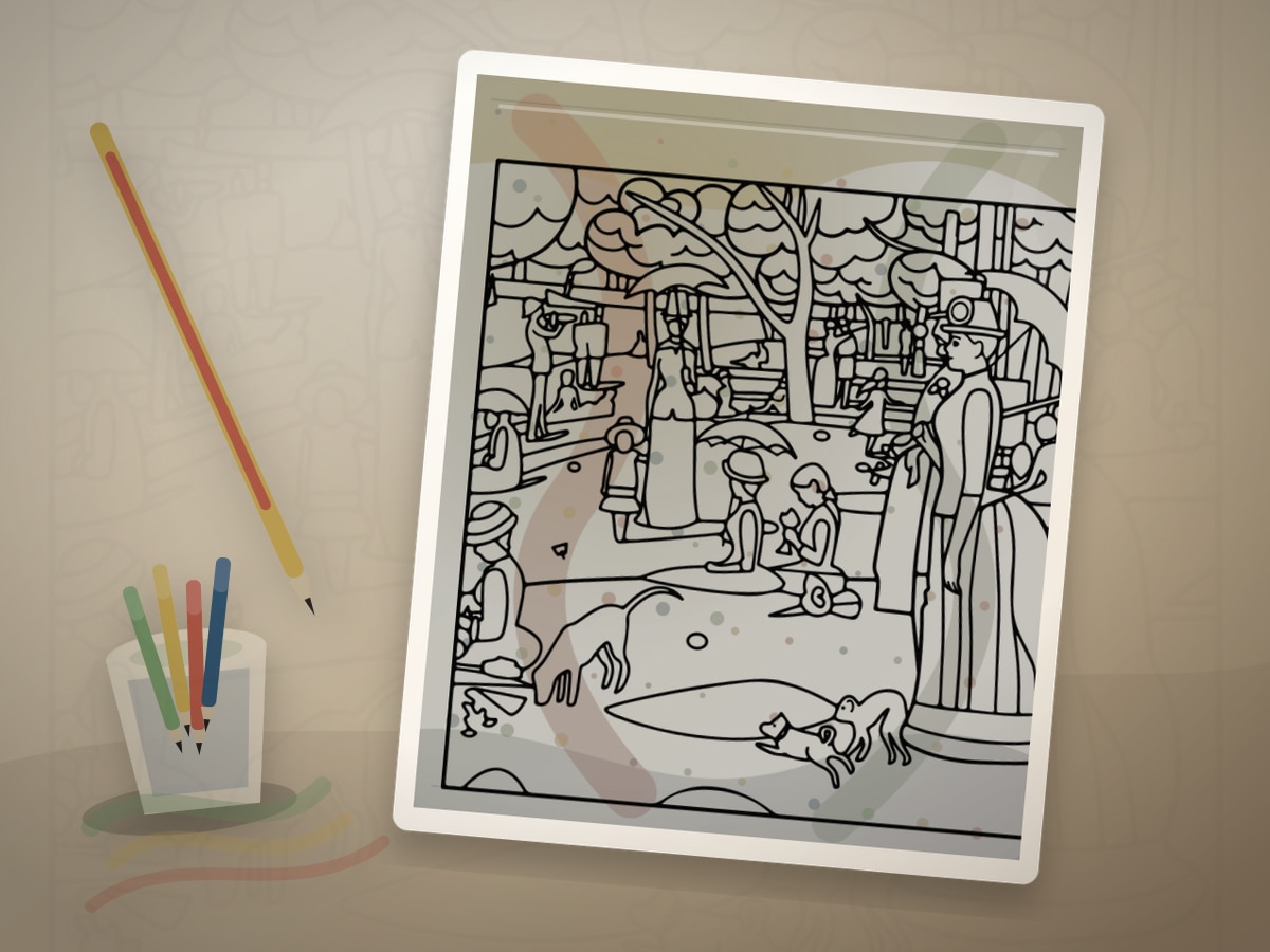
Georges Seurat and Neo-Impressionism are associated with tiny touches of color that blend in the eye from a distance. For coloring pages, the principle becomes dot placement: closer dots for shadow, wider dots for light.
What This Style Teaches
The useful traits to look for are:
- small dots
- neighbor colors
- density shadows
- optical mixing
- patient texture
Seurat Pointillism Coloring Technique should feel like a visual translation, not a costume. Let small marks that mix optically at a distance guide the page, then use the artist reference as a boundary for value, rhythm, and restraint. The best results usually come from leaving some areas quieter than you first planned.
Best Pages to Try
This approach works especially well with flower coloring pages, food coloring pages, landscape coloring pages, insect coloring pages. The page should leave room for small marks that mix optically at a distance, even if the subject is not a literal museum scene.
For a first attempt, choose medium detail with one clear focal area. That balance leaves room for small marks that mix optically at a distance without burying the main idea in tiny spaces.
The strongest printable page is one where the line art already hints at parks, gardens, water, skies, portraits, and open background areas. You do not need an exact art-history subject; you need a page with shapes that can carry the same light, contour, pattern, or movement.
A spare print is useful, but use it with a specific question about small marks that mix optically at a distance. Testing one decision keeps the finished page from becoming overworked.
Palette and Materials
Suggested palette: #2563eb, #f97316, #22c55e, #f472b6, #fde047.
Fineliners, sharp colored pencils, and fine-tip markers work. Gel pens can add dots too, but give them drying time.
Treat the palette as a limited studio set for small marks that mix optically at a distance. One color should carry the main mood, one should build structure, one should soften transitions, and one should be held back for the final accent.
Sharp pencils, fine markers, patient dots, and a spare sheet under your hand will usually get you closer to the style than a large rainbow set. A smaller tool group keeps the page from drifting away from the reference mood.
Step-by-Step Method
- Start with a small area such as fruit, petals, water, or sky.
- Choose neighboring colors rather than one flat hue.
- Use more dots in shadow areas and fewer dots in highlights.
- Vary dot size based on page scale.
- Restore only essential outlines after the dots are finished.
Pause after the first third of the page and compare it with the style goal. If the page has lost small marks that mix optically at a distance, adjust value and repetition before filling more spaces.
Finishing Judgment for Seurat Pointillism Coloring Technique
The clearest sign of a finished page is hierarchy. Decide what should be seen first, what should support it, and what can stay quiet. Dot density changes gradually instead of forming accidental outlines.
Edges are part of the style decision when dot density changes gradually instead of forming accidental outlines. Keep the important contour or highlight crisp, then let secondary texture soften into the paper so the page has depth without becoming fussy.
Before adding final accents, view the page from across the room or at thumbnail size. If the main idea still reads as small marks that mix optically at a distance, the page needs fewer additions than you think.
Where Seurat Pointillism Coloring Technique Works Best
On figure or portrait pages, apply the style first to the face, hands, hair, or clothing fold. That focal area should show the strongest version of small marks that mix optically at a distance.
On parks, gardens, water, skies, portraits, and open background areas, translate the reference through palette and edge quality. A few disciplined details will say more than forcing every space to announce the source.
On dense patterns, simplify around small marks that mix optically at a distance. Choose two repeating motifs for the strongest color and let the remaining shapes act as rhythm, border, or rest.
Common Mistakes to Avoid
- Do not start with a full-page background.
- Do not press so hard that every dot dents the paper.
- Do not use unrelated colors unless you want a very graphic effect.
The biggest risk is over-explaining the reference. A page can feel inspired by a style with only a few disciplined choices around small marks that mix optically at a distance: palette, value, edge quality, and one repeated motif.
If a new color appears late, make it serve the plan for small marks that mix optically at a distance. Echo it in one small place or keep it so limited that it reads as a deliberate accent.
Example Practice
Print a flower or fruit page. Dot the highlight area with yellow and peach, the middle with orange or rose, and the shadow with red-violet or brown.
After the exercise, look for the one decision that made small marks that mix optically at a distance clearer. Repeat that decision on the next page before adding a second new skill.
Troubleshooting Seurat Pointillism Coloring Technique
If the page looks flat, check whether small marks that mix optically at a distance is actually visible. Add contrast near the focal point, repeat the key color, or reduce a background that is pulling too much attention.
If small marks that mix optically at a distance feels weak, make one decision stronger instead of adding five new ones. Deepen the focal contrast, repeat the accent, or simplify the background.
Step back before deciding the color is too pale. That single correction usually does more than adding another layer everywhere.
Related Coloring Guides
Continue with colored pencil layering, Impressionist palettes, short coloring breaks.
Read those next if you want small marks that mix optically at a distance to connect with broader skills such as light planning, color restraint, texture, or controlled accents.
Next Page to Print
Choose flower coloring pages with one visible place for small marks that mix optically at a distance. Limit the first version to the palette and tool group above so the style remains clear.
For the second version, change only one variable that affects small marks that mix optically at a distance: a darker background, a softer edge, a different accent, or a new subject. That comparison teaches more than jumping to a completely unrelated page.
Quick FAQ
Do I need to copy the original artist exactly?
No. Use the artist or movement as a source of decisions, not as an imitation test. A limited palette, a clear value plan, and one signature visual idea around small marks that mix optically at a distance are enough.
What should I print first?
Start with pages with open areas for repeated marks. It should have enough detail to show the technique, but not so much detail that every mark becomes a decision.
How do I know when to stop?
Stop when dot density changes gradually instead of forming accidental outlines. If another layer would make the focal point less clear, the page is already finished enough.
Final Thought
Seurat Pointillism Coloring Technique gives a printable page an art-historical point of view without turning coloring into a copy exercise. Let small marks that mix optically at a distance guide the strongest choices, keep the palette disciplined, and leave enough quiet space for the style to breathe.