Ukiyo-e Coloring Palettes: Flat Color, Cropping, Pattern, and Negative Space
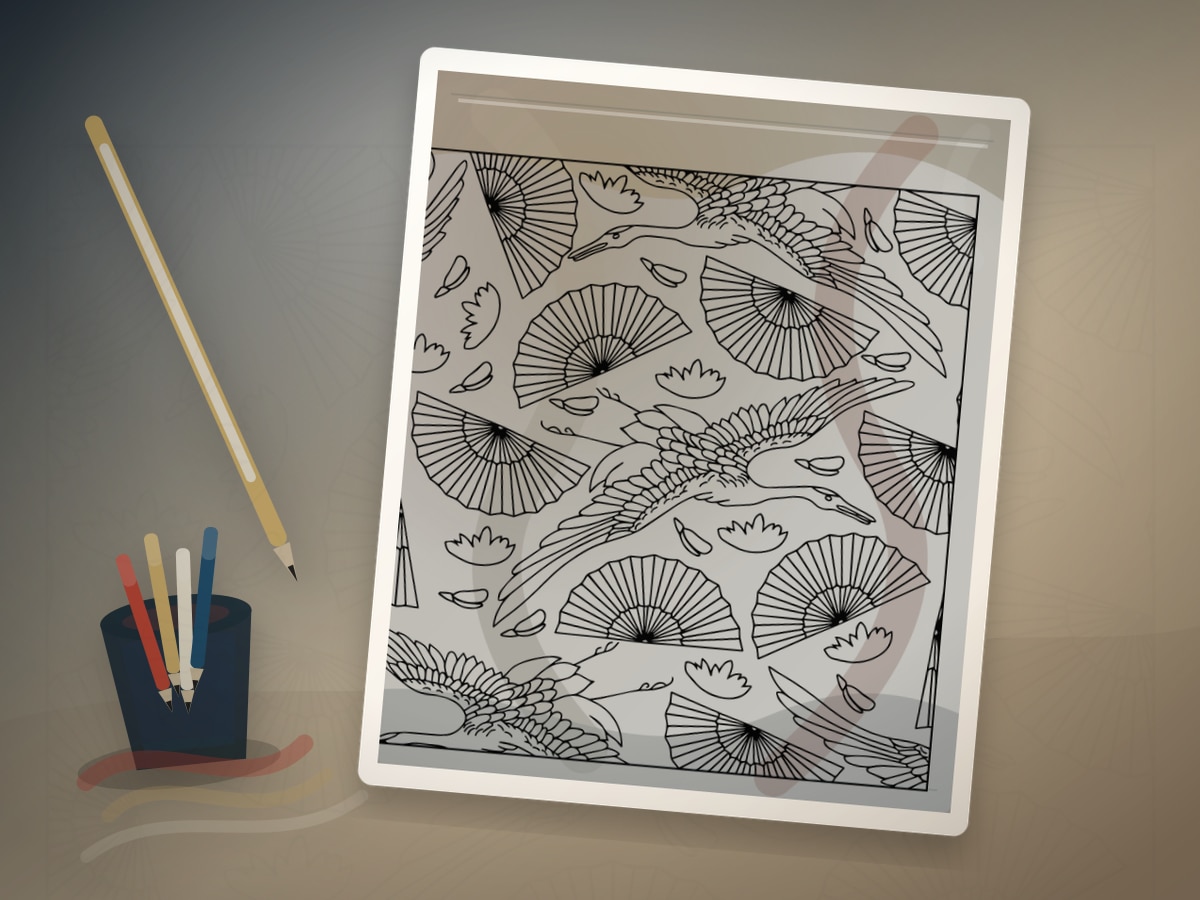
Ukiyo-e-inspired coloring is clear, bold, and beautifully organized. It works for waves, birds, flowers, landscapes, rain, bridges, fans, fashion, and seasonal scenes.
Ukiyo-e was an Edo-period Japanese print tradition associated with woodblock prints and the floating world. Artists such as Hokusai and Hiroshige helped make landscapes, weather, actors, fashion, and seasonal views widely recognizable. For coloring, the lesson is flat color, contour, pattern, and negative space.
What This Style Teaches
The useful traits to look for are:
- clean outlines
- flat color blocks
- cropped compositions
- seasonal motifs
- patterned fabric or water
Ukiyo-e Coloring Palettes should feel like a visual translation, not a costume. Let flat color, strong contour, and elegant empty space guide the page, then use the artist reference as a boundary for value, rhythm, and restraint. The best results usually come from leaving some areas quieter than you first planned.
Best Pages to Try
This approach works especially well with sea life coloring pages, bird coloring pages, flower coloring pages, landscape coloring pages. The page should leave room for flat color, strong contour, and elegant empty space, even if the subject is not a literal museum scene.
For a first attempt, choose medium detail with one clear focal area. That balance leaves room for flat color, strong contour, and elegant empty space without burying the main idea in tiny spaces.
The strongest printable page is one where the line art already hints at waves, fans, birds, kimonos, trees, and cropped landscape views. You do not need an exact art-history subject; you need a page with shapes that can carry the same light, contour, pattern, or movement.
A spare print is useful, but use it with a specific question about flat color, strong contour, and elegant empty space. Testing one decision keeps the finished page from becoming overworked.
Palette and Materials
Suggested palette: #1d4f91, #d34a36, #f2d28a, #1f6f5b, #f7f1e3.
Markers are strong for flat print-like areas. Colored pencils can add light texture without losing clarity. Use fineliners only to restore essential contours.
Treat the palette as a limited studio set for flat color, strong contour, and elegant empty space. One color should carry the main mood, one should build structure, one should soften transitions, and one should be held back for the final accent.
Indigo, brick red, warm beige, dark blue, and smooth markers or pencils will usually get you closer to the style than a large rainbow set. A smaller tool group keeps the page from drifting away from the reference mood.
Step-by-Step Method
- Choose a limited print-like palette: indigo, soft red, cream, green, gray, and one accent.
- Keep large areas flat rather than heavily blended.
- Preserve white space in foam, snow, clouds, or paper margins.
- Use repeated pattern in water, fabric, rain, or background.
- Let one dramatic crop or diagonal movement guide the eye.
Pause after the first third of the page and compare it with the style goal. If the page has lost flat color, strong contour, and elegant empty space, adjust value and repetition before filling more spaces.
Finishing Judgment for Ukiyo-e Coloring Palettes
The clearest sign of a finished page is hierarchy. Decide what should be seen first, what should support it, and what can stay quiet. Large flat areas stay calm while pattern carries the detail.
Edges are part of the style decision when large flat areas stay calm while pattern carries the detail. Keep the important contour or highlight crisp, then let secondary texture soften into the paper so the page has depth without becoming fussy.
Before adding final accents, view the page from across the room or at thumbnail size. If the main idea still reads as flat color, strong contour, and elegant empty space, the page needs fewer additions than you think.
Where Ukiyo-e Coloring Palettes Works Best
On figure or portrait pages, apply the style first to the face, hands, hair, or clothing fold. That focal area should show the strongest version of flat color, strong contour, and elegant empty space.
On waves, fans, birds, kimonos, trees, and cropped landscape views, translate the reference through palette and edge quality. A few disciplined details will say more than forcing every space to announce the source.
On dense patterns, simplify around flat color, strong contour, and elegant empty space. Choose two repeating motifs for the strongest color and let the remaining shapes act as rhythm, border, or rest.
Common Mistakes to Avoid
- Do not collapse all Japanese-inspired coloring into waves.
- Do not fill every quiet space.
- Do not add painterly gradients everywhere if the page needs print clarity.
The biggest risk is over-explaining the reference. A page can feel inspired by a style with only a few disciplined choices around flat color, strong contour, and elegant empty space: palette, value, edge quality, and one repeated motif.
If a new color appears late, make it serve the plan for flat color, strong contour, and elegant empty space. Echo it in one small place or keep it so limited that it reads as a deliberate accent.
Example Practice
Print a bird, flower, or ocean page. Use indigo for the dominant shape, cream for quiet space, red for a small accent, and green or gray for supporting forms.
After the exercise, look for the one decision that made flat color, strong contour, and elegant empty space clearer. Repeat that decision on the next page before adding a second new skill.
Troubleshooting Ukiyo-e Coloring Palettes
If the page looks flat, check whether flat color, strong contour, and elegant empty space is actually visible. Add contrast near the focal point, repeat the key color, or reduce a background that is pulling too much attention.
If flat color, strong contour, and elegant empty space feels weak, make one decision stronger instead of adding five new ones. Deepen the focal contrast, repeat the accent, or simplify the background.
Keep shadows graphic instead of blending every edge. That single correction usually does more than adding another layer everywhere.
Related Coloring Guides
Continue with Hokusai wave coloring, choosing colors, mixed media planning.
Read those next if you want flat color, strong contour, and elegant empty space to connect with broader skills such as light planning, color restraint, texture, or controlled accents.
Next Page to Print
Choose sea life coloring pages with one visible place for flat color, strong contour, and elegant empty space. Limit the first version to the palette and tool group above so the style remains clear.
For the second version, change only one variable that affects flat color, strong contour, and elegant empty space: a darker background, a softer edge, a different accent, or a new subject. That comparison teaches more than jumping to a completely unrelated page.
Quick FAQ
Do I need to copy the original artist exactly?
No. Use the artist or movement as a source of decisions, not as an imitation test. A limited palette, a clear value plan, and one signature visual idea around flat color, strong contour, and elegant empty space are enough.
What should I print first?
Start with pages with bold outlines and negative space. It should have enough detail to show the technique, but not so much detail that every mark becomes a decision.
How do I know when to stop?
Stop when large flat areas stay calm while pattern carries the detail. If another layer would make the focal point less clear, the page is already finished enough.
Further Reading
- The Met Heilbrunn Timeline: Ukiyo-e Style
- The Met Heilbrunn Timeline: Woodblock Prints in Ukiyo-e Style
Final Thought
Ukiyo-e Coloring Palettes gives a printable page an art-historical point of view without turning coloring into a copy exercise. Let flat color, strong contour, and elegant empty space guide the strongest choices, keep the palette disciplined, and leave enough quiet space for the style to breathe.