Van Gogh-Inspired Coloring Pages: Movement, Texture, and Expressive Color
Van Gogh-inspired coloring is most powerful when it feels alive. The goal is not to copy a painting, but to borrow visual principles: visible marks, directional strokes, emotional color, and backgrounds that move with the subject.
Vincent van Gogh worked in the late nineteenth century and used oil paint in expressive strokes that often follow the form of sky, flowers, fields, trees, and rooms. For coloring pages, those strokes can become pencil, crayon, pastel, or marker marks.
What This Style Teaches
The useful traits to look for are:
- visible directional strokes
- warm-cool contrast
- active backgrounds
- textured skies
- expressive rather than realistic color
Van Gogh-Inspired Coloring Pages should feel like a visual translation, not a costume. Let visible stroke direction and color that feels energetic guide the page, then use the artist reference as a boundary for value, rhythm, and restraint. The best results usually come from leaving some areas quieter than you first planned.
Best Pages to Try
This approach works especially well with landscape coloring pages, flower coloring pages, space coloring pages, tree and plant coloring pages. The page should leave room for visible stroke direction and color that feels energetic, even if the subject is not a literal museum scene.
For a first attempt, choose medium detail with one clear focal area. That balance leaves room for visible stroke direction and color that feels energetic without burying the main idea in tiny spaces.
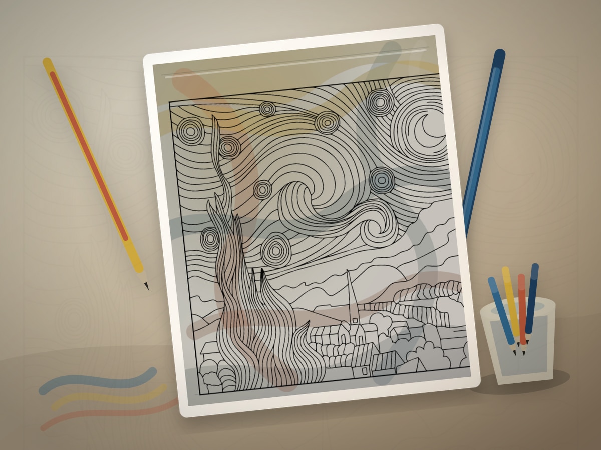
The strongest printable page is one where the line art already hints at swirling skies, cypress trees, flowers, landscapes, and expressive rooms. You do not need an exact art-history subject; you need a page with shapes that can carry the same light, contour, pattern, or movement.
A spare print is useful, but use it with a specific question about visible stroke direction and color that feels energetic. Testing one decision keeps the finished page from becoming overworked.
Palette and Materials
Suggested palette: #1d4ed8, #f5c542, #f97316, #2f9e5f, #6d4fd3.
Crayons, colored pencils, and pastel pencils all show marks beautifully. Markers can work if you add dry pencil or gel pen strokes on top.
Treat the palette as a limited studio set for visible stroke direction and color that feels energetic. One color should carry the main mood, one should build structure, one should soften transitions, and one should be held back for the final accent.
Blue, gold, green, orange, and pencils or markers used in short strokes will usually get you closer to the style than a large rainbow set. A smaller tool group keeps the page from drifting away from the reference mood.
Step-by-Step Method
- Choose the movement path before coloring: swirl, wave, vertical rise, or radiating glow.
- Use short strokes rather than smooth fill in skies, grass, petals, and backgrounds.
- Place warm colors beside cool colors so yellow, orange, and blue feel energetic.
- Let the background participate instead of staying blank.
- Restore only the most important outlines after the texture is complete.
Pause after the first third of the page and compare it with the style goal. If the page has lost visible stroke direction and color that feels energetic, adjust value and repetition before filling more spaces.
Finishing Judgment for Van Gogh-Inspired Coloring Pages
The clearest sign of a finished page is hierarchy. Decide what should be seen first, what should support it, and what can stay quiet. The strokes curve with the sky, tree, petal, or field instead of filling flatly.
Edges are part of the style decision when the strokes curve with the sky, tree, petal, or field instead of filling flatly. Keep the important contour or highlight crisp, then let secondary texture soften into the paper so the page has depth without becoming fussy.
Before adding final accents, view the page from across the room or at thumbnail size. If the main idea still reads as visible stroke direction and color that feels energetic, the page needs fewer additions than you think.
Where Van Gogh-Inspired Coloring Pages Works Best
On figure or portrait pages, apply the style first to the face, hands, hair, or clothing fold. That focal area should show the strongest version of visible stroke direction and color that feels energetic.
On swirling skies, cypress trees, flowers, landscapes, and expressive rooms, translate the reference through palette and edge quality. A few disciplined details will say more than forcing every space to announce the source.
On dense patterns, simplify around visible stroke direction and color that feels energetic. Choose two repeating motifs for the strongest color and let the remaining shapes act as rhythm, border, or rest.
Common Mistakes to Avoid
- Do not blend every stroke away.
- Do not use swirls everywhere without a focal direction.
- Do not forget value contrast; texture still needs light and dark.
The biggest risk is over-explaining the reference. A page can feel inspired by a style with only a few disciplined choices around visible stroke direction and color that feels energetic: palette, value, edge quality, and one repeated motif.
If a new color appears late, make it serve the plan for visible stroke direction and color that feels energetic. Echo it in one small place or keep it so limited that it reads as a deliberate accent.
Example Practice
Print a landscape or flower page. Use blue, yellow, green, orange, and cream. Fill the background with visible curved strokes, then add darker accents only near the focal point.
After the exercise, look for the one decision that made visible stroke direction and color that feels energetic clearer. Repeat that decision on the next page before adding a second new skill.
Troubleshooting Van Gogh-Inspired Coloring Pages
If the page looks flat, check whether visible stroke direction and color that feels energetic is actually visible. Add contrast near the focal point, repeat the key color, or reduce a background that is pulling too much attention.
If visible stroke direction and color that feels energetic feels weak, make one decision stronger instead of adding five new ones. Deepen the focal contrast, repeat the accent, or simplify the background.
Repeat the stroke direction before adding a new color. That single correction usually does more than adding another layer everywhere.
Related Coloring Guides
Continue with Turner-inspired skies, colored pencil layering, light source coloring.
Read those next if you want visible stroke direction and color that feels energetic to connect with broader skills such as light planning, color restraint, texture, or controlled accents.
Next Page to Print
Choose landscape coloring pages with one visible place for visible stroke direction and color that feels energetic. Limit the first version to the palette and tool group above so the style remains clear.
For the second version, change only one variable that affects visible stroke direction and color that feels energetic: a darker background, a softer edge, a different accent, or a new subject. That comparison teaches more than jumping to a completely unrelated page.
Quick FAQ
Do I need to copy the original artist exactly?
No. Use the artist or movement as a source of decisions, not as an imitation test. A limited palette, a clear value plan, and one signature visual idea around visible stroke direction and color that feels energetic are enough.
What should I print first?
Start with landscapes and flowers with movement lines. It should have enough detail to show the technique, but not so much detail that every mark becomes a decision.
How do I know when to stop?
Stop when the strokes curve with the sky, tree, petal, or field instead of filling flatly. If another layer would make the focal point less clear, the page is already finished enough.
Final Thought
Van Gogh-Inspired Coloring Pages gives a printable page an art-historical point of view without turning coloring into a copy exercise. Let visible stroke direction and color that feels energetic guide the strongest choices, keep the palette disciplined, and leave enough quiet space for the style to breathe.