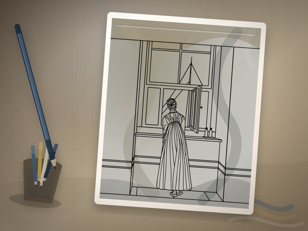
Vermeer Window Light Coloring: Soft Interiors and Pearly Highlights
Vermeer-inspired coloring is quiet. The page should feel as if daylight has entered a room and settled gently across a face, table, letter, instrument, bowl, or folded cloth. This approach is useful for interiors, reading figures, windows, kitchens, tiled floors, and still lifes.
Johannes Vermeer is associated with Dutch Golden Age domestic scenes, carefully organized rooms, and subtle daylight. The practical coloring lesson is controlled side light: one window direction, restrained color, and small pearly highlights.
What This Style Teaches
The useful traits to look for are:
- side-window light
- soft blue and yellow relationships
- calm interior geometry
- muted cast shadows
- tiny highlights on glass, pearls, eyes, or fabric
Vermeer Window Light Coloring should feel like a visual translation, not a costume. Let soft daylight crossing a room from one side guide the page, then use the artist reference as a boundary for value, rhythm, and restraint. The best results usually come from leaving some areas quieter than you first planned.
Best Pages to Try
This approach works especially well with indoor coloring pages, people coloring pages, object coloring pages, face coloring pages. The page should leave room for soft daylight crossing a room from one side, even if the subject is not a literal museum scene.
For a first attempt, choose medium detail with one clear focal area. That balance leaves room for soft daylight crossing a room from one side without burying the main idea in tiny spaces.
The strongest printable page is one where the line art already hints at windows, tables, fabrics, tiled floors, and still interiors. You do not need an exact art-history subject; you need a page with shapes that can carry the same light, contour, pattern, or movement.
A spare print is useful, but use it with a specific question about soft daylight crossing a room from one side. Testing one decision keeps the finished page from becoming overworked.
Palette and Materials
Suggested palette: #1f4e8c, #78a6c8, #e4bf63, #f2e6cf, #8b7d6b.
Soft colored pencils are ideal for Vermeer-style transitions. Markers can work for flat walls or furniture, but choose pale colors and avoid streaky saturation in faces.
Treat the palette as a limited studio set for soft daylight crossing a room from one side. One color should carry the main mood, one should build structure, one should soften transitions, and one should be held back for the final accent.
Muted blue, warm yellow, pearl gray, and gentle brown pencils will usually get you closer to the style than a large rainbow set. A smaller tool group keeps the page from drifting away from the reference mood.
Step-by-Step Method
- Imagine the window before you color. Light from the left means left-facing planes stay clearer and warmer.
- Use ivory, pale ochre, warm gray, and muted blue instead of harsh white walls.
- Shade away from the window with gray-blue, taupe, or soft umber.
- Let one blue or yellow area be the main color and keep the rest quieter.
- Add pearl-like highlights as tiny rounded shapes, not broad white streaks.
Pause after the first third of the page and compare it with the style goal. If the page has lost soft daylight crossing a room from one side, adjust value and repetition before filling more spaces.
Finishing Judgment for Vermeer Window Light Coloring
The clearest sign of a finished page is hierarchy. Decide what should be seen first, what should support it, and what can stay quiet. The quiet side of the room stays soft while the window edge stays crisp.
Edges are part of the style decision when the quiet side of the room stays soft while the window edge stays crisp. Keep the important contour or highlight crisp, then let secondary texture soften into the paper so the page has depth without becoming fussy.
Before adding final accents, view the page from across the room or at thumbnail size. If the main idea still reads as soft daylight crossing a room from one side, the page needs fewer additions than you think.
Where Vermeer Window Light Coloring Works Best
On figure or portrait pages, apply the style first to the face, hands, hair, or clothing fold. That focal area should show the strongest version of soft daylight crossing a room from one side.
On windows, tables, fabrics, tiled floors, and still interiors, translate the reference through palette and edge quality. A few disciplined details will say more than forcing every space to announce the source.
On dense patterns, simplify around soft daylight crossing a room from one side. Choose two repeating motifs for the strongest color and let the remaining shapes act as rhythm, border, or rest.
Common Mistakes to Avoid
- Do not make every object equally bright.
- Do not turn the background into a busy landscape if the window is the light source.
- Do not use saturated jewel colors everywhere; restraint creates stillness.
The biggest risk is over-explaining the reference. A page can feel inspired by a style with only a few disciplined choices around soft daylight crossing a room from one side: palette, value, edge quality, and one repeated motif.
If a new color appears late, make it serve the plan for soft daylight crossing a room from one side. Echo it in one small place or keep it so limited that it reads as a deliberate accent.
Example Practice
Choose a room scene. Color the window side of the wall ivory, the far side warm gray, and one major fabric area blue. Add soft shadows under hands, bowls, and furniture legs, then stop before the page becomes noisy.
After the exercise, look for the one decision that made soft daylight crossing a room from one side clearer. Repeat that decision on the next page before adding a second new skill.
Troubleshooting Vermeer Window Light Coloring
If the page looks flat, check whether soft daylight crossing a room from one side is actually visible. Add contrast near the focal point, repeat the key color, or reduce a background that is pulling too much attention.
If soft daylight crossing a room from one side feels weak, make one decision stronger instead of adding five new ones. Deepen the focal contrast, repeat the accent, or simplify the background.
Cool the shadows with gray blue instead of darkening everything. That single correction usually does more than adding another layer everywhere.
Related Coloring Guides
Continue with Rembrandt light and shadow, planning a light source, shading basics.
Read those next if you want soft daylight crossing a room from one side to connect with broader skills such as light planning, color restraint, texture, or controlled accents.
Next Page to Print
Choose indoor coloring pages with one visible place for soft daylight crossing a room from one side. Limit the first version to the palette and tool group above so the style remains clear.
For the second version, change only one variable that affects soft daylight crossing a room from one side: a darker background, a softer edge, a different accent, or a new subject. That comparison teaches more than jumping to a completely unrelated page.
Quick FAQ
Do I need to copy the original artist exactly?
No. Use the artist or movement as a source of decisions, not as an imitation test. A limited palette, a clear value plan, and one signature visual idea around soft daylight crossing a room from one side are enough.
What should I print first?
Start with interior scenes with a clear window or doorway. It should have enough detail to show the technique, but not so much detail that every mark becomes a decision.
How do I know when to stop?
Stop when the quiet side of the room stays soft while the window edge stays crisp. If another layer would make the focal point less clear, the page is already finished enough.
Further Reading
Final Thought
Vermeer Window Light Coloring gives a printable page an art-historical point of view without turning coloring into a copy exercise. Let soft daylight crossing a room from one side guide the strongest choices, keep the palette disciplined, and leave enough quiet space for the style to breathe.